Dear Artists, hello,
Here is my new little article with examples based on my works.
The trick about creating depth is to use various value. Everything at the horizon becomes lighter and purple-gray-blue due to increase of mass of the air between the viewer and the distant object.
Preferable way to attack it and improve the skill for both oils and acrylics is to mix those colors on the pallet and NOT on the canvas.
When object moves closer to the viewer the value of the colors darkens. The darkest darks happen in the foreground as well as lightest lights. This creates maximum contrast and pushes pale distant objects back even further.
Ups. What is value in painting? Value is measure of light or darkness of the paint if to subtract color component (like seeing it in black and white). In other words this is how much white you add to the color from the tube to lighten it up, or how much of the any dark color (burnt umber, Prussian blue, phtalo green+alyzarin crimson ) you add to the original color out of the tube to create dark shades. Human eyes made this way that first see value and only then color, thus you'll see white and black below as example of value chart. This is scale from 1 to 12 in example I used.
Please see this photo of the painting below that follows this rule (Please Open in a new Tab to read the text).
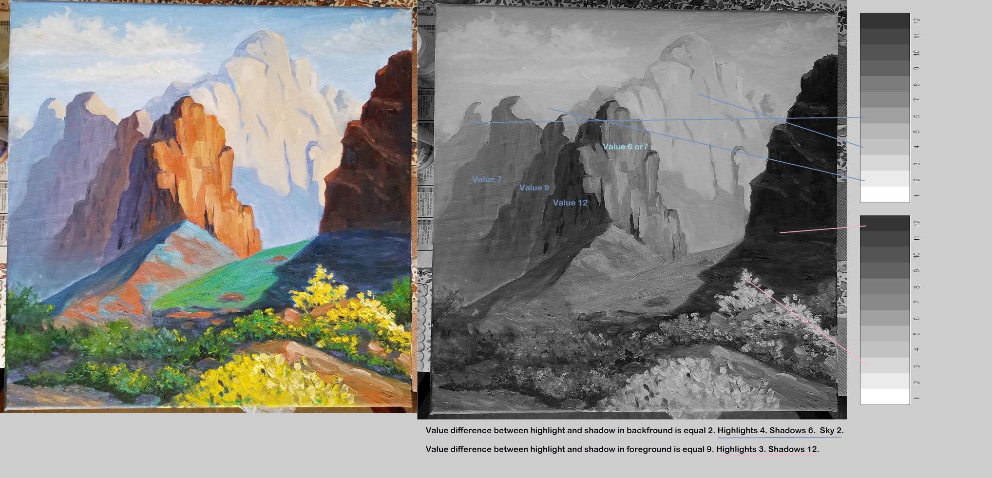
Above, in a good example, you can see that difference in dark and light value in the background is way-way less than in foreground when we talk about shadows and highlights.
Also color(!! bringing color back now !!!) becomes warmer as we progress to the foreground. So the good trick is to use your phone and apply filter for B&W on your camera to see if your values are great to create the distance. Later on with more and more paintings in your artistic suitcase you will start seeing the darkness and lightness without the conversion to black and white.
Another trick to create distance is through colors - do not use same exact colors as highlights on the far away mountains (refer to the first rule) and on the objects up-close. Preferably pure white straight of the tube is supposed to be preserved for foreground tiniest highlights. But, hey, it is art and rules can be bended if needed.
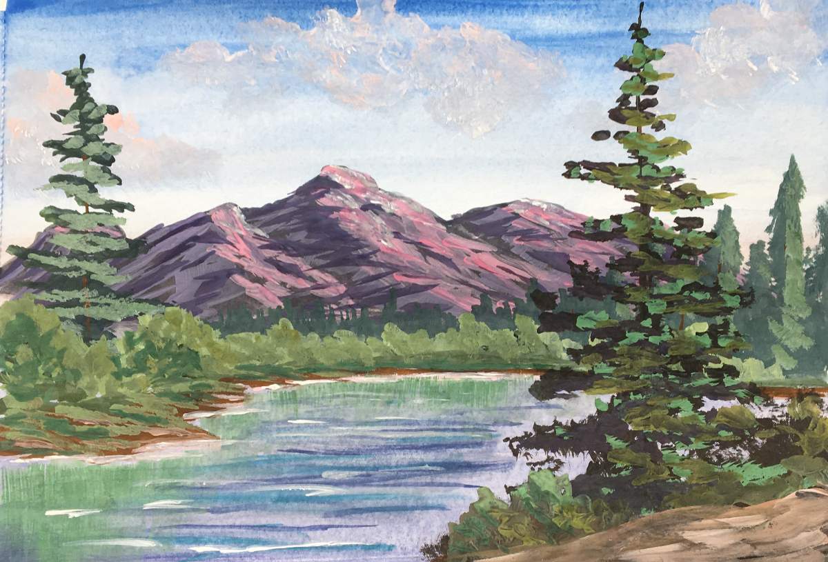
Here on the painting above (gouache) is unsuccessful example of creating the depth. You can see that highlight in the background is made of warm pink color that brings entire mountain forward. And guess what is a bigger mistake here? Answer: value of the mountains is quite dark compare to the sky to push it back in the distance.
I hope I added some value how to create the distance using those couple of ideas.
Stay safe!
Best regards,
Sunnylady
Couple of links to videos from YouTube, really good and quick ones for further investigations.
https://youtu.be/tOGDmamxQwE
https://youtu.be/ax130yILbw0
https://youtu.be/iVJAJTk2uNI